Demystifying Accessibility: Alt Text and Image Descriptions
From scientific diagrams to historical paintings, charts to mathematical formulas, higher education is filled to the brim with important images that convey critical information in a quick to process visual format. Unfortunately, for a variety of reasons, these images may be inaccessible to the students.
The inaccessibility of educational materials often bars blind or visually impaired individuals from fields; especially those that heavily rely on images, such as STEM and the fine arts. And accommodations can do little to help them when the solution is not additional time or application of proper assistive technology.
This is where visual descriptions come into play. Let’s dive in.
Assistive Technology
To start, let's talk about the that will using the image descriptions we'll be learning about. When it comes to visual accessibility, there are two primary tools to keep in mind while creating or remediating content.
- This software is paired with either a speech synthesizer or braille display to let blind or visually impaired users access digital content. They will read aloud alt text and image captions, something that Text-to-Speech Software often won’t do.
- Less a separate technology and more an ingrained element of multi-media content, audio descriptions relay important visual information in audio form and are synchronously embedded into the content.
Fortunately for us, the process of preparing content for use by these technologies is the same across the board. You'll be using the same principles for describing the visuals of your content, regardless of medium or modality.
What Does It Say?
The key to visual accessibility is in conveying the intended message of the content, not just the appearance. Preferably, this is done in a manner that is just as efficient as viewing the image visually.

No matter what method of description you use (or assistive tool that the student uses), the final message is what matters most. What do you want students to take away from the image in question? What do you want them to actually see and comprehend?
Another way to consider the problem: If you had to describe the visual to a colleague over the phone, particularly when you need them to fully understand the image in question, how would you describe it? What points would you focus on?
And if you’re looking at an image and say to yourself, “but there is no message. I wouldn’t bother telling my colleague/student about this.” This means you’ve identified an image that does not contribute meaningfully to the content, and you don’t need to spend time describing it in detail.
Now, Let's Talk About "Mark as Decorative"
If you’re using an accessibility checker like Ally or Adobe Acrobat Pro, you’ve likely seen that alluring little check box. Selecting “Mark as Decorative” tells everyone, from accessibility checkers to assistive technology, to ignore that particular image.
But when can you actually check that box without harming the students who rely on assistive tech?
The easiest way is to look at the image and ask yourself, “Would I draw attention to this during a lecture/presentation?” or “Would I consider the book/article unusable if this image were damaged or missing?” While not a foolproof method, it’s a good starting point.
Here are some tips to help you decide:
Mark as decorative:
- Borders and flourishes that contribute to the aesthetic of the media
- Stock photos that break up the page but don’t provide information
- Icons or designs that sit next to already labeled text (such as a map icon next to “Location”)
- Repetitive elements, such as backgrounds or logos in the header of every page
Use visual descriptions:
- Maps, charts, or graphs that are not described adequately in the associated text
- Visual examples that are meant to supplement written text, such as images that show how to apply the information
- Logos or other branding material that convey identity (excluding repeated visuals)
If you’re still not sure, you can use, along with plenty of for visual accessibility.
And one final note: While it may be tempting to overcompensate and describe everything you can see, this can actually be more harmful than helpful. Can you imagine having to listen to ten minutes of visual descriptions for random stock photos that have nothing to do with the thing you’re trying to learn?
The nice thing about visuals is that they can convey information quickly, and we want to preserve that efficiency when possible.
So, Visual Descriptions: What Are They and What's the Difference?
For the most part, visual accessibility is handled by taking the visual element, be it an image, a diagram, or supplemental examples, and describing it in words. Technically, all of these fall under the category of (also known as image descriptions), but are often broken down into more specific terms. Let’s take a quick glance at each:
For some images, you want your viewers to process the concept conveyed quickly before moving on to other information. The deeper context is likely already covered in surrounding text, and the image only serves to supplement that text. This is where you use alt-text.
Alt-text is short and concise. It focuses on the critical information conveyed, and is embedded in the media itself.
For complex images where you want your viewers to dive deeper into the information conveyed, you’ll want to provide a much longer description. This more detailed description is typically either included in the surrounding text, or listed at the back of the book in an ‘Extended Descriptions’ section.
Long descriptions are detailed, but still focus on key elements that are necessary to fully understand the intent of the image.
For video content where important images are used but not explicitly described, audio descriptions (or AD) are a way to provide that important context to blind or visually impaired viewers. AD features create a break in video content (or use pre-existing gaps) and then verbally describe the visuals currently displayed.
Audio descriptions can be short, like alt-text, or more detailed, like long descriptions, depending on the complexity of the visuals.
How to Write Alternative Text
Before we jump into the actual writing of alt-text, let’s address adding it in the first place.
When creating a document or web page, there will typically be an option to add alt-text as you are designing, though it can sometimes be hidden in image settings. Additionally, certain platforms might have limitations on how long your alt-text can be.
Explore your preferred authoring tools to ensure you know where these settings are. It’s always easier to address accessibility proactively, as opposed to having to remedy pre-existing documents or pages.
Now, here are some loose guidelines to follow while writing alt-text:
- Do:
-
- Keep it short: If you can’t describe the image in a handful of words, then alt-text isn’t the proper solution. See the long descriptions section below.
- Prioritize critical information: When context allows, put the most important information at the beginning of the alt-text.
- Spell out text: It is highly advised to avoid text in images, but if text is present and is important for the context, spell it out exactly.
- Use punctuation: Space characters and commas are most important, but all punctuation helps make the information easier to understand.
- List specific image types: If using the word “image” doesn’t provide adequate context, specify the type of image. Examples include charts, logos, and maps.
- Don't:
-
- Add superfluous information: If a detail doesn’t contribute to the message, don’t include it. If you can swap a color with another, it doesn’t contribute. Same goes for orientations, positions, or configurations.
- Describe extraneous text: If text is included but is not critical to understanding the image, do not spell it out. This is commonly relevant in maps.
- Skip critical context: If the description could apply to different concepts, make sure to clarify it. Likewise, if there might be confusion of what the description means, clarify. A common example involves scientific names.
- Specify generic image types: Screen readers will announce the presence of an image, so do not include words like “image of,” “photo of,” or “icon of.”
Here are some examples of alt-text in practice:

Bird: Tufted Titmouse

A map of Houston, Texas, USA

A bar chart showing favorite sport by number of students, with Basketball ranked highest
How to Write Long Descriptions
Sometimes the message you are trying to convey with an image simply can’t be described in a handful of sentences and isn’t present in the surrounding text. Detailed charts or graphs, fine art, or images where layout and composition are integral to understanding the image all fall under the category of This is where long descriptions come into play.
It should also be noted that complex images should also include alt-text. In this particular case, the alt-text should point users to where the long description can be found.
Now, here is a general workflow you can use to write long descriptions:
- Step 1:
- Start with important context. Things like the title, image type, and creator are all details you would want to start with. Additionally, if your image description is located within or near the relevant text, put ‘Image Description’ at the very beginning. Some writers will also put the description in brackets to help differentiate it from the surrounding text.
- Step 2:
- Give a brief overview of the image. Summarize the most important elements of the visual, focusing on the purpose or intended message of the image. This can be anywhere from a short sentence to several sentences long, depending on the image itself. This context helps users decide if they want to continue reading the description.
- Step 3:
- Break the image up into sections. This will help provide a logical flow to the image description, and will also help guide you as you write out the various details. Images can be broken up into quadrants, compass directions, or by clock face, depending on their layout and context. Once you begin writing details, start at the focal point and then move to adjacent sections to maintain proper flow.
- Step 4:
- Begin writing details. Focus on the elements that are most important to the intended message of the image or are needed to make sense of other critical details. Not only does this provide context for the rest of the image description, it also helps prevent misunderstandings or overlooked details. It’s good practice to make sure the description makes sense on the first read-through.
- Step 5:
- Review and refine your written description. Writing image descriptions is often similar to writing a story, and the first draft is never the one you want to publish. Not only do you want to ensure there are no spelling or grammar mistakes (something that all writers must contend with, no matter how smart they are), but you also want to make sure the description is clear and effective.
Here are some examples of long descriptions in practice:

Image Description: An illustrated diagram of a simplified cross section of a hydroelectric dam. It depicts the architecture of the dam itself, the generator facilities, and the output of both water and electricity.
On the far left of the image, a reservoir filled with water is held up by the dam wall. The dam is depicted in gray, extends straight down on the left and slopes gently down on the right. At the bottom of the reservoir is a metal grate labeled “intake”, which allows water to flow through a tunnel labeled “penstock”. Below the penstock is the foundation of the dam.
Water flowing through the penstock turns a turbine located at the bottom center of the image, before flowing through a tunnel and back into the river on the right. Above the turbine is an attached generator, which sits in a building labeled ‘powerhouse’. Yellow power lines are connected to the generator and exit the powerhouse to the right. They connect to a gray tower labeled ‘long distance power lines’ before continuing off the image to the right.

Image Description: Morning (1851), is an oil painting by Ivan Aivazovsky, painted in the romantic style. It depicts a large ship, located towards the bottom right corner, while a small family stands on the shore near a small rowboat in the bottom left corner.
The ship appears to be sailing away, pointing towards a bright morning sun that is softened by the surrounding sea fog. It is painted in soft, hazy whites that blend into the gentle yellow background. The shadow of the ship extends behind it towards the shore and is sharply defined and dark, in contrast to the light and ethereal sails above it, creating an atmospheric perspective.
The figures on the dark brown shoreline are also rendered in sharp detail and darker shades. A man in black clothes hugs a woman in a white dress while a young boy stands nearby. Just off the shore is a similarly painted rowboat with two figures inside, one standing while the other is sitting near their feet. They both hold oars and are looking at the family on the shore.
The horizon line is soft and hazy, blurring the line between ocean and sky. The low contrast almost hides a second ship, settled in the distance to the far right. On the left side of the painting, rocky mountains fade into the distance, losing contrast the farther they get, lending to the atmospheric perspective.
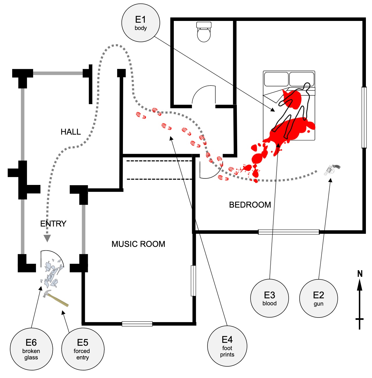
Image Description: A drawing of a crime scene, showing a house with one murder victim and related notations. In the northeastern corner of the house, the outline of the victim is shown lying on a bed with a label reading ‘E1: Body’.
A gun sits on the bedroom floor southeast of the bed and is labeled ‘E2: Gun’. Blood is shown in red and starts as two large puddles underneath the victim, labeled ‘E3: Blood’, before trailing into footprints labeled ‘E4: footprints’.
The trail of footprints lead out of the bedroom to the west, past the bathroom and music room before disappearing. The trail is accompanied by a dotted gray line that leads from the gun, and continues beyond the faded footprints, traveling south through the hall and entry room before stopping at a door.
A hammer, labeled ‘E5: forced entry’ and shattered glass labeled ‘E6: broken glass’ sit in the southwestern corner of the scene.
How to Embed Audio Descriptions
Since audio descriptions are less a different type of description and more a matter of how the description is delivered, this section will focus mostly on how you would embed your descriptions directly into a video. The process of writing the descriptions themselves is the same as the two processes listed above, depending on the complexity of the visuals you need to describe.
Much like with captions and other video/audio related accessibility features, every platform will have a different process for adding audio descriptions to a video. Additionally, the time provided for your audio descriptions will likely vary as well.
For example, that allows you to add a secondary audio track that can be toggled on or off. However, since the feature simply changes the audio track and does not create a pause in the accompanied video, audio descriptions must fit into natural pauses in the dialogue.
In contrast, allows content creators to insert audio descriptions that, when turned on by a viewer, will pause the video. This allows for lengthier audio descriptions that might be critical for more complex visuals. It should be noted, though, that the enhanced audio feature is a paid version of their which functions the same way as YouTube’s.
Review your platform of choice to see if they have audio description features available and how a creator would go about adding them.
Conclusion
We know that describing visual media can be very daunting, but there are many resources available to help, and the more you practice, the easier it will get. Additionally, it’s important to remember that if your content isn’t accessible, it isn’t usable. The quality of your course content can dramatically improve with the use of these explicit descriptions, which can prevent misunderstandings and confusion among your students, even those who don’t have explicit accommodation requirements.
It’s that high quality learning experience that we are striving for, and while it’s not always easy, it is always worth it.

Meet the Author
Ray Seiden, M.S., is our Faculty Success Designer and is responsible for designing, developing, and delivering professional development training modules aimed at enhancing faculty teaching excellence. They use their experience in Instructional Design and Graphic Design, alongside their passion for accessibility and andragogy, to create user friendly training materials and robust support programs for faculty.
Do you have a topic you want to write about in a blog post? Pending review, the CITL may host it here!
Email us your topic to start the process!